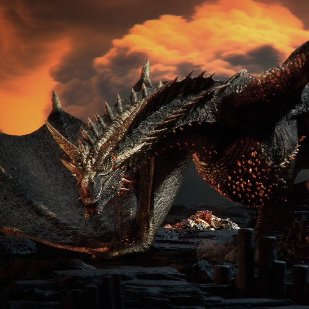
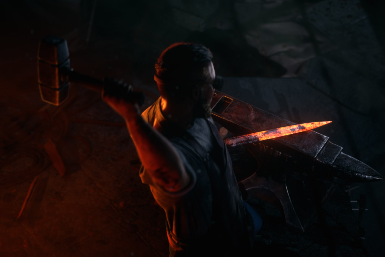
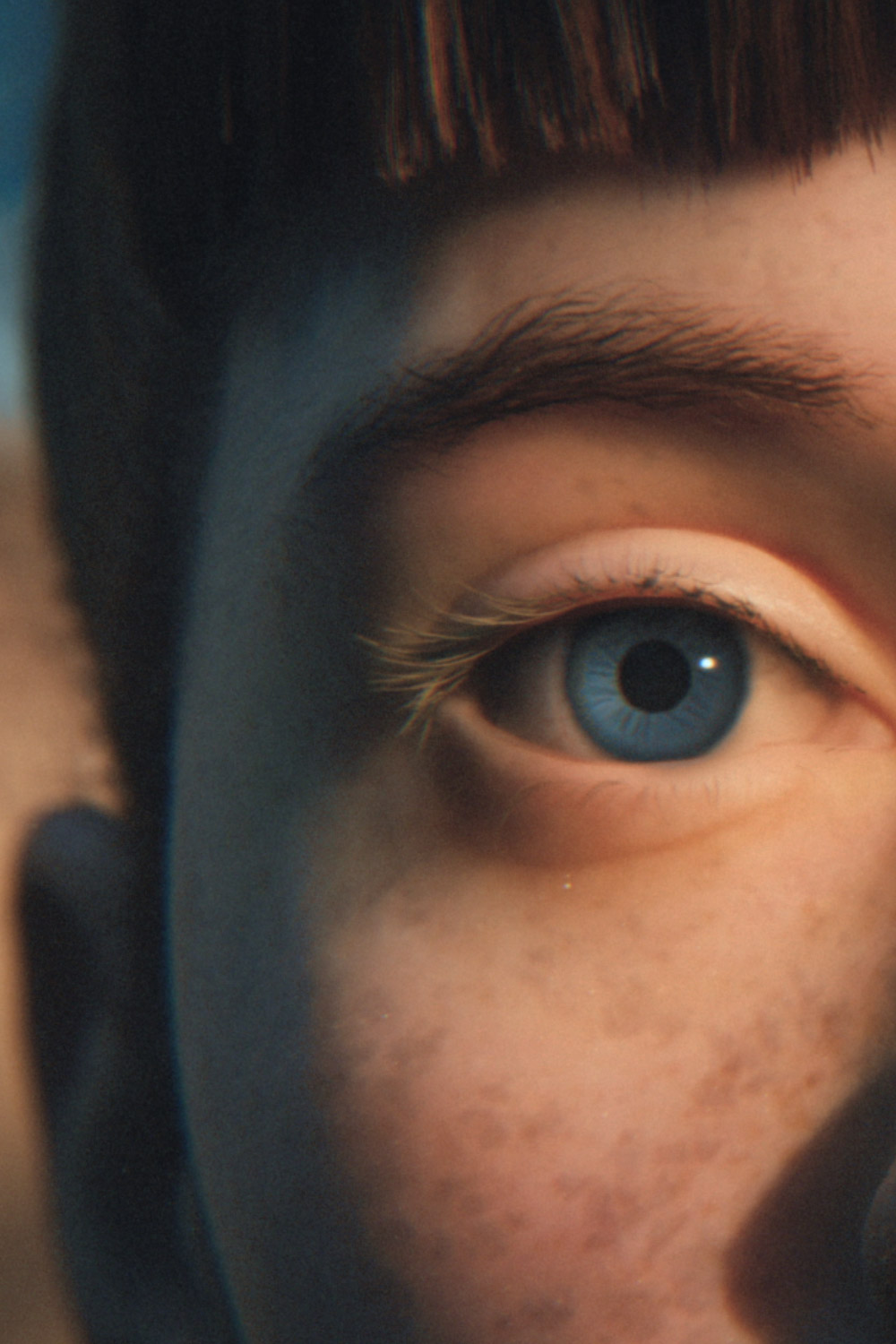
Illustration, 3D modeling, and compositing brought ‘King Five’ heroes to life in the Winamax Poker campaign.
King Five
Soixante-Seize asked us to create two KeyVisuals for the campaign of the Winamax Online Poker tournament.
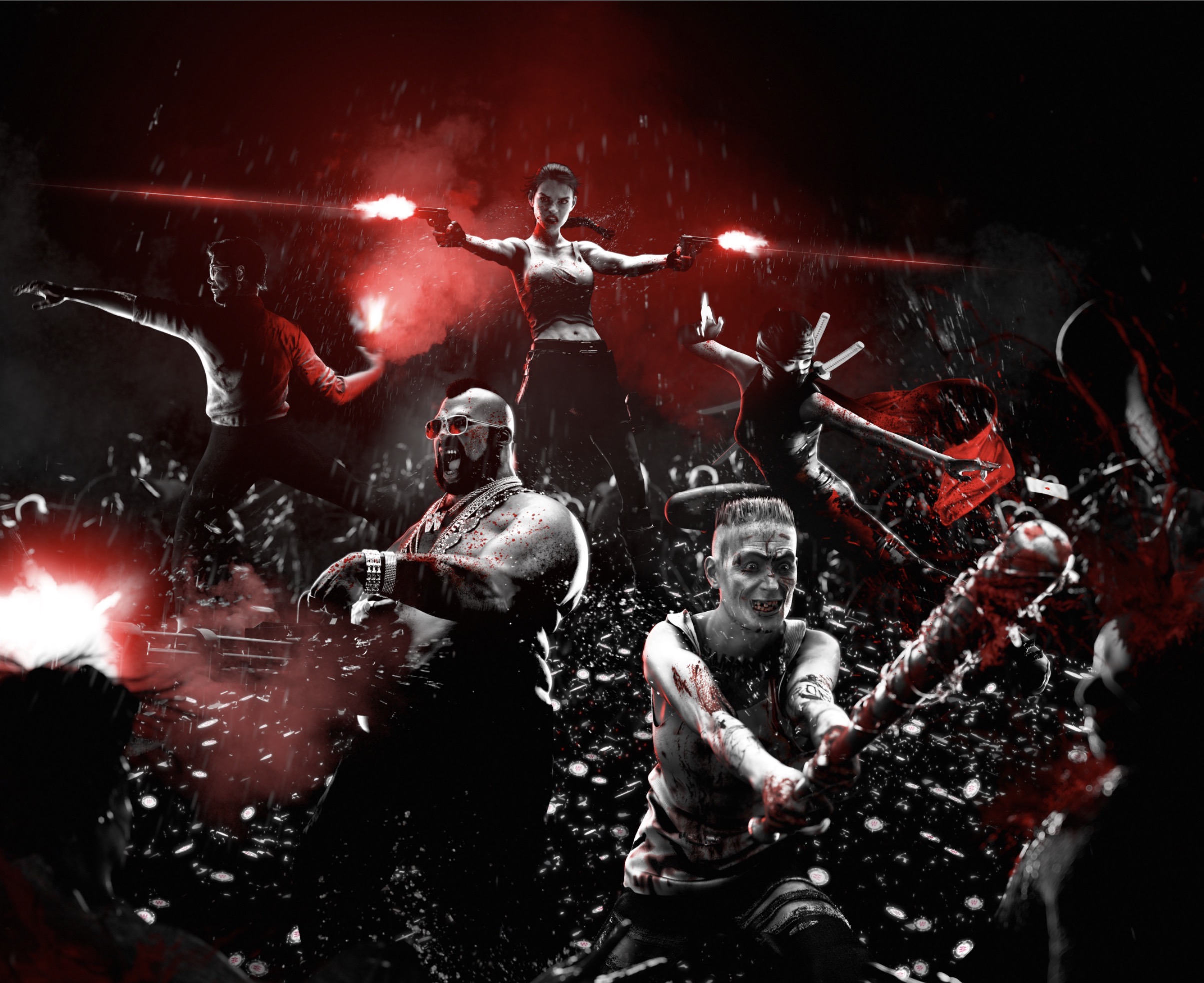
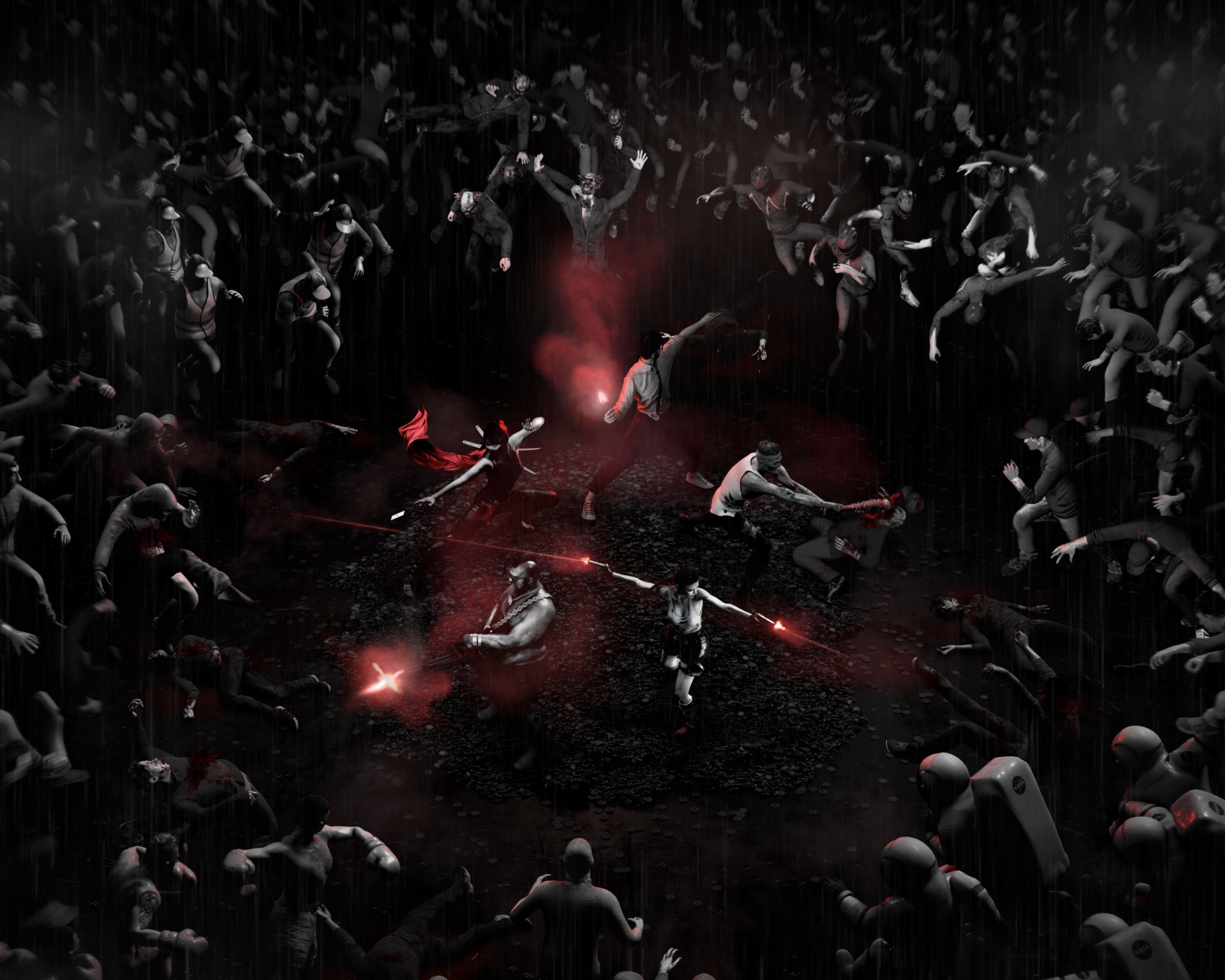
Tigrelab was in charge of the illustration, 3D modeling, and compositing. The visual represents the «King Five», a team of 5 hero characters surrounded and attacked everywhere by numerous waves of enemies. To represent the teams in the crowd the characters are inspired by real teams from previous years.
Process
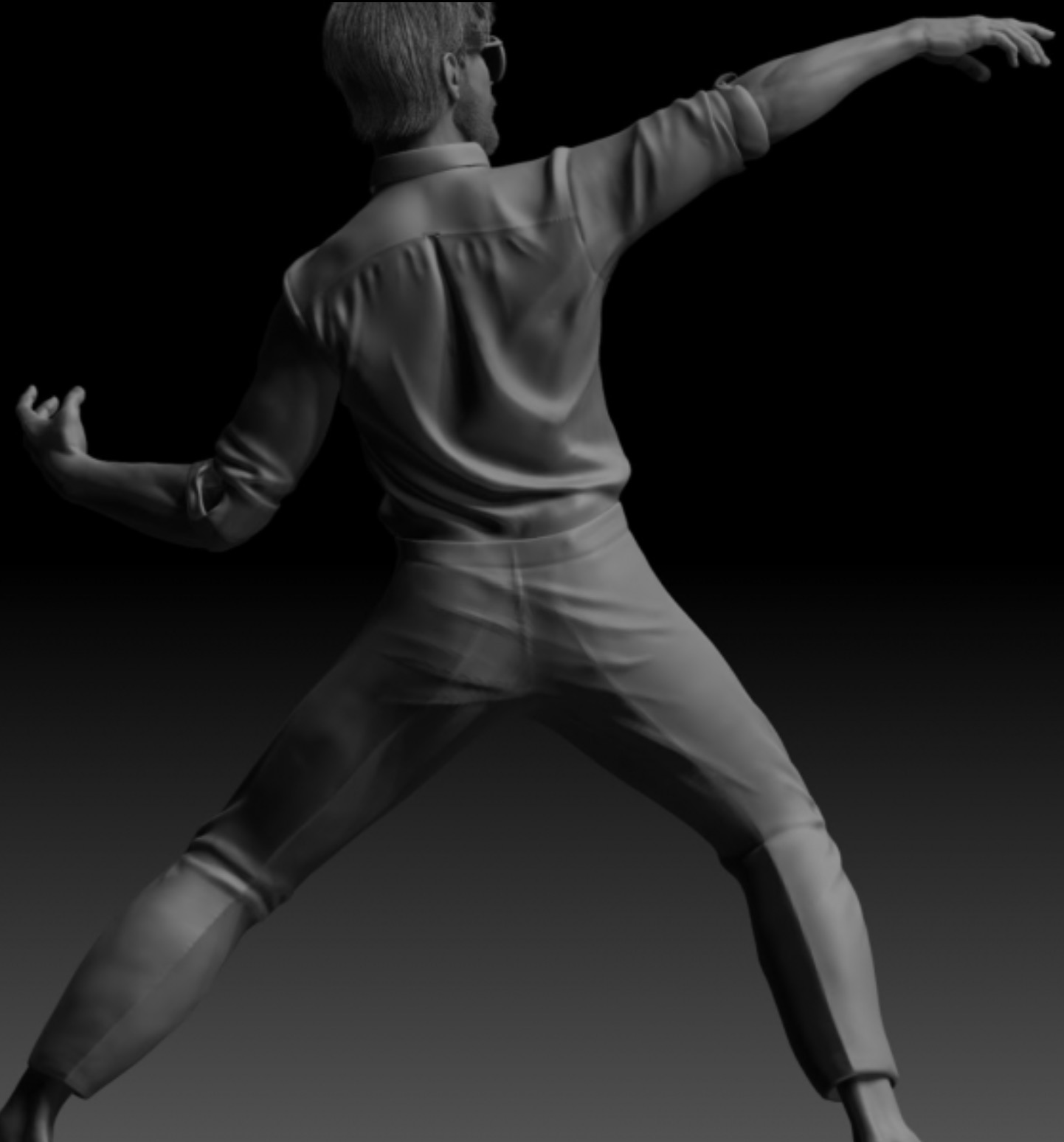
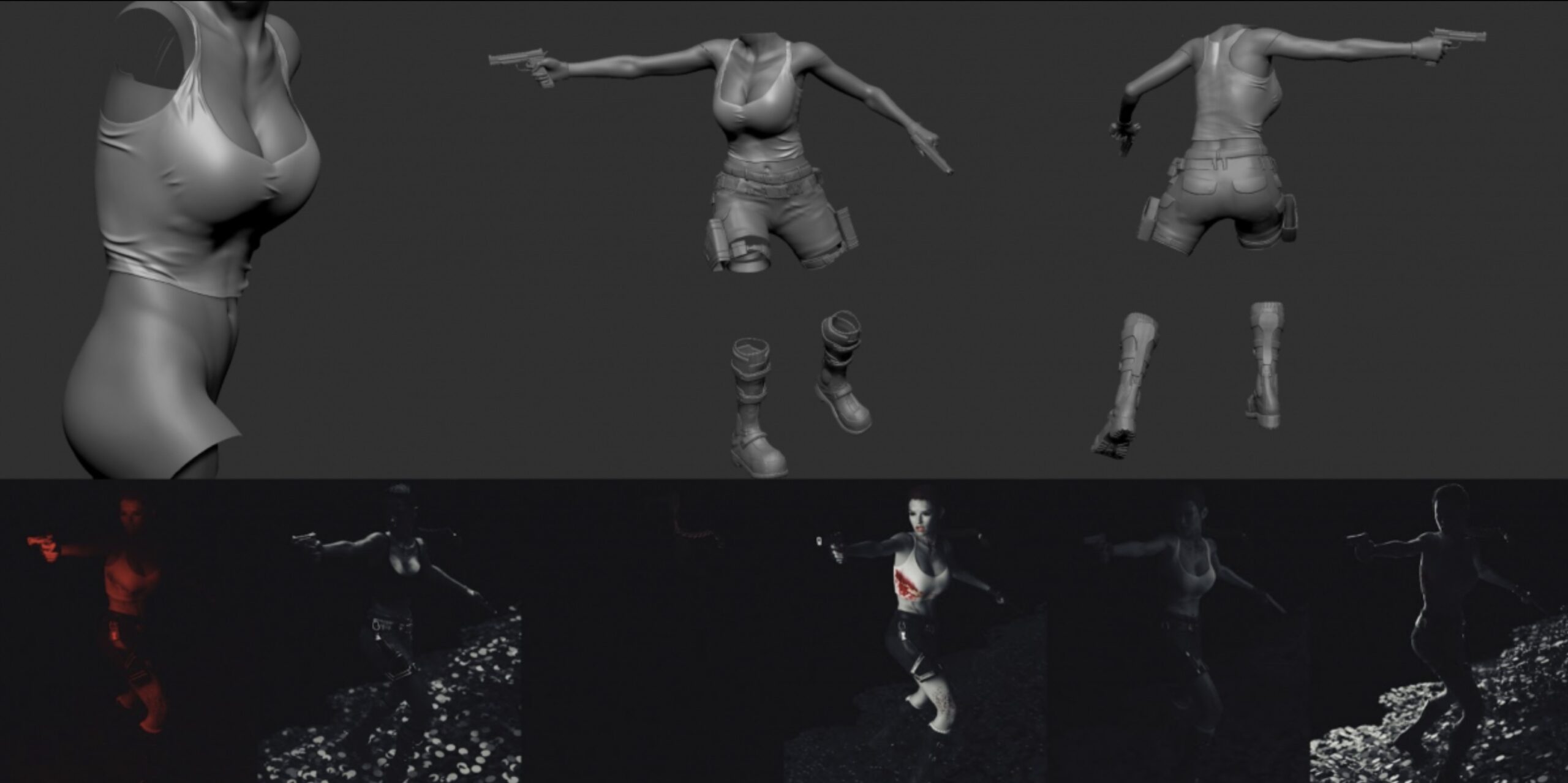
It has been a very complex piece so we started with a 3D mockup of the scene to define the position of the camera and characters. Once approved, the concept artist designed the key visual of the tournament in a 2D illustration, the image aimed to empathize with the five characters and the situation they are in.
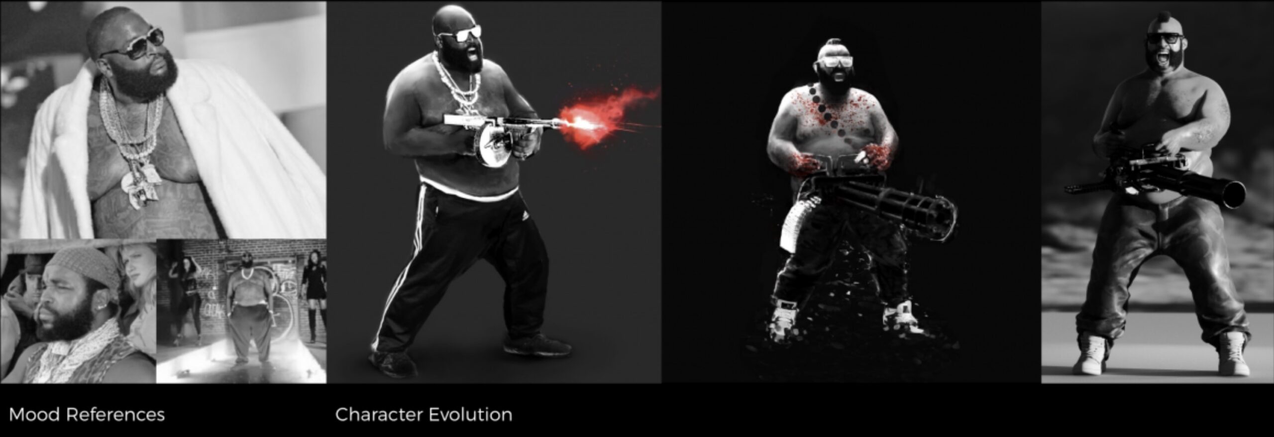
Then we modeled the scene in 3D for print in 15K. The main challenge was to give life to the characters, each one must transcribe an emotion, for its posture and its face in line with the situation.
The King Five Characters
To make the spectator feel projected into our image and feel emotions, we needed to endow our feelings hero in tune with the situation in which the King Five characters are. We were immersed in the heart of an ultra-violent scene, where our characters were in an extreme situation and might seem desperate. In an extreme situation, extreme emotions.
We had to move towards an atmosphere where our fighters, to survive, must kill at least a hundred similar humans, that aren’t zombies or robots, so to get there a good dose of madness is necessary and unpredictable.
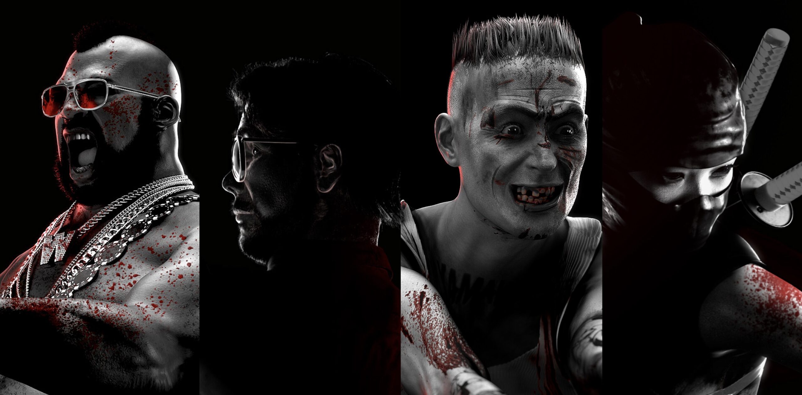
Loss of reason, pleasant and devastating obsession, or chronic fear, each character transcribed an emotion, by its posture and its expense, in line with the situation.
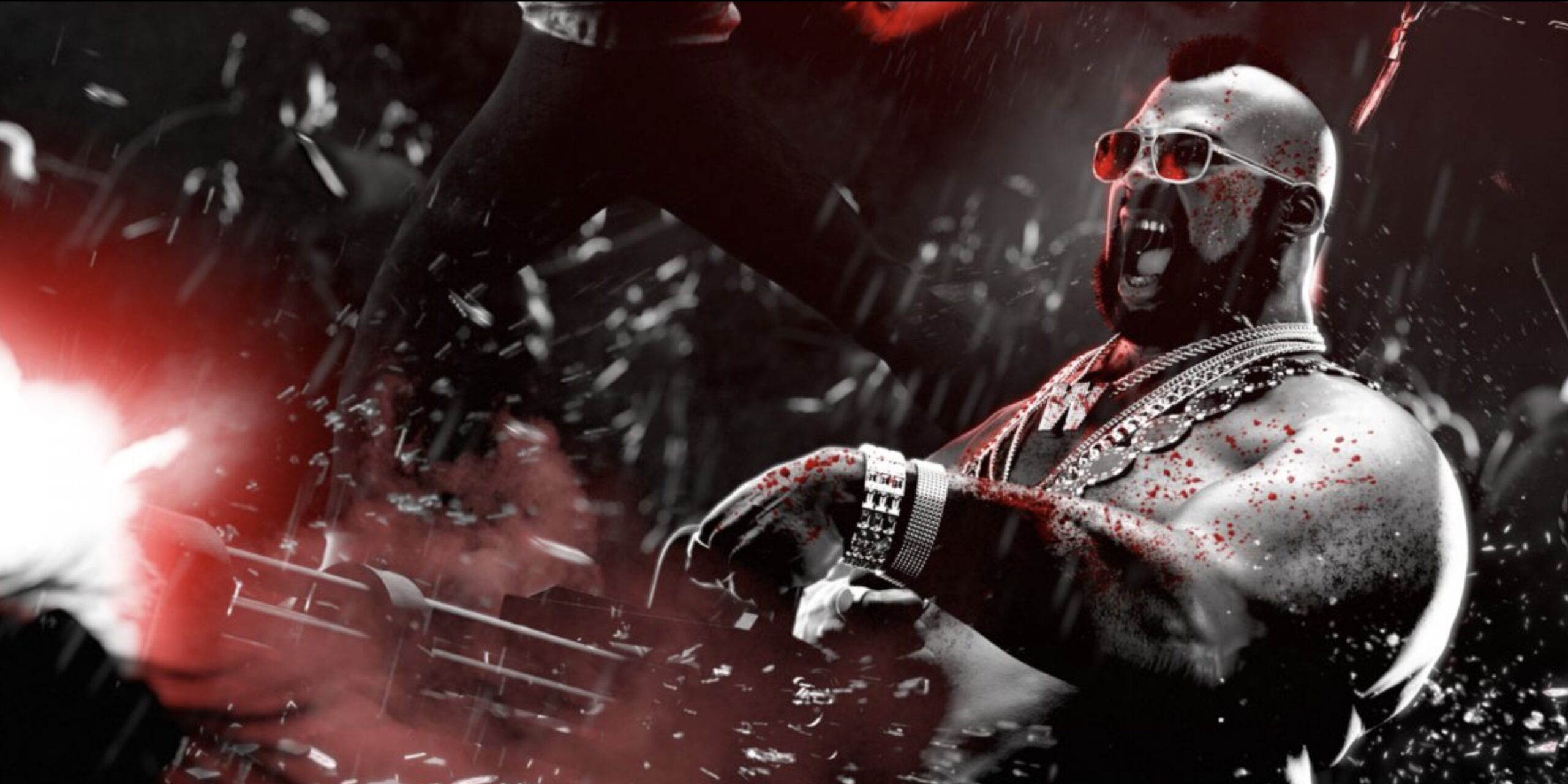
The Strengh
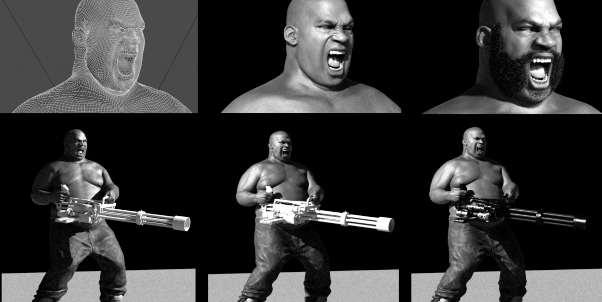
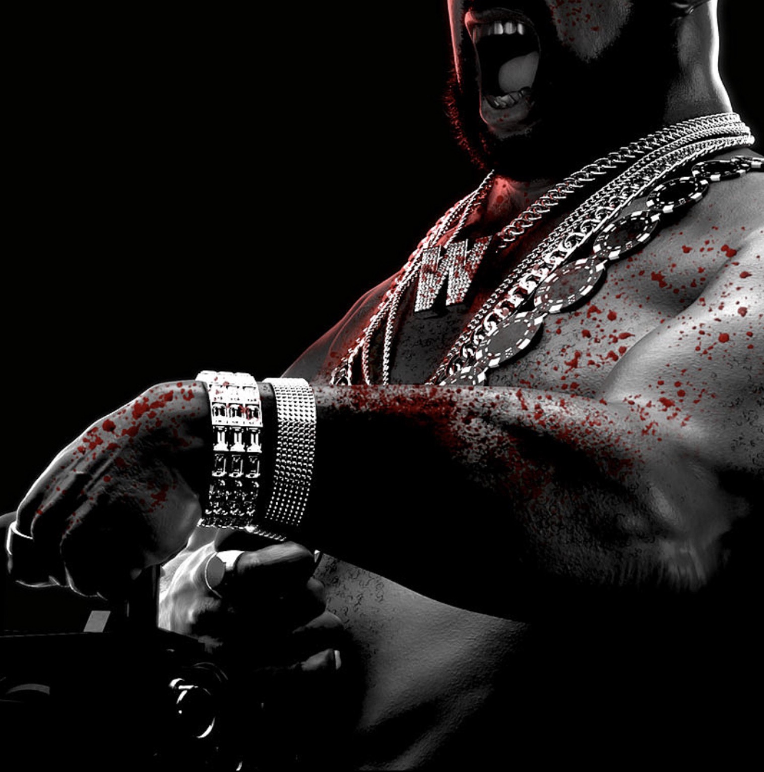
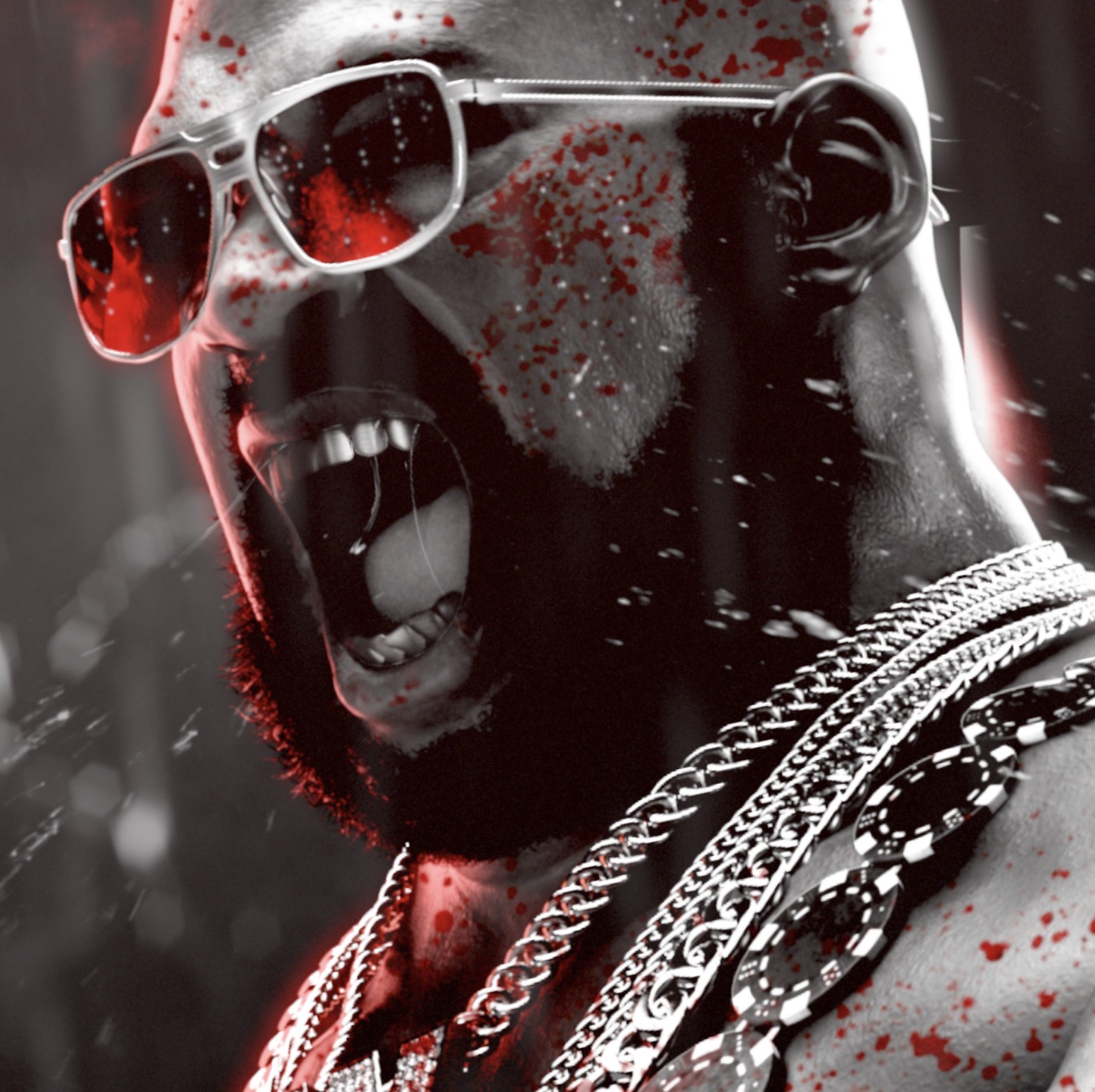
Imposing man with a high quality of narcissism. He has an extravagant perception of himself, is cool, and knows he’s going to tease everyone with his big machine gun. He is very confident, calm and determined. We can feel the scream of anger and aggressiveness on his face.
The Stalker
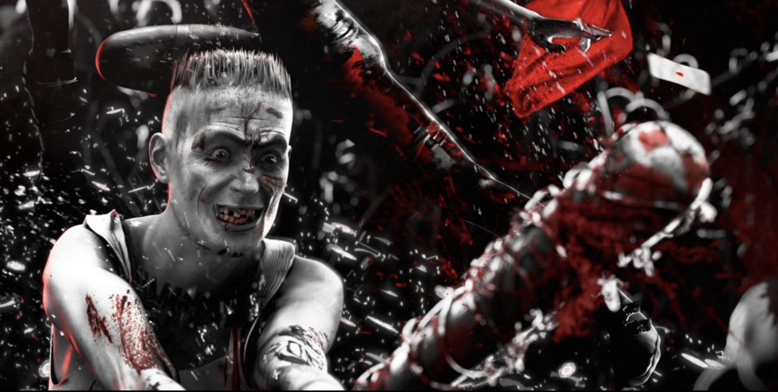
He has psychotic disorders with impulsive aggression and the purpose of doing damage. He is merciless and furious, nothing scares him. Out of control, he freaked out and knocked everyone out with his battle.

The Agility
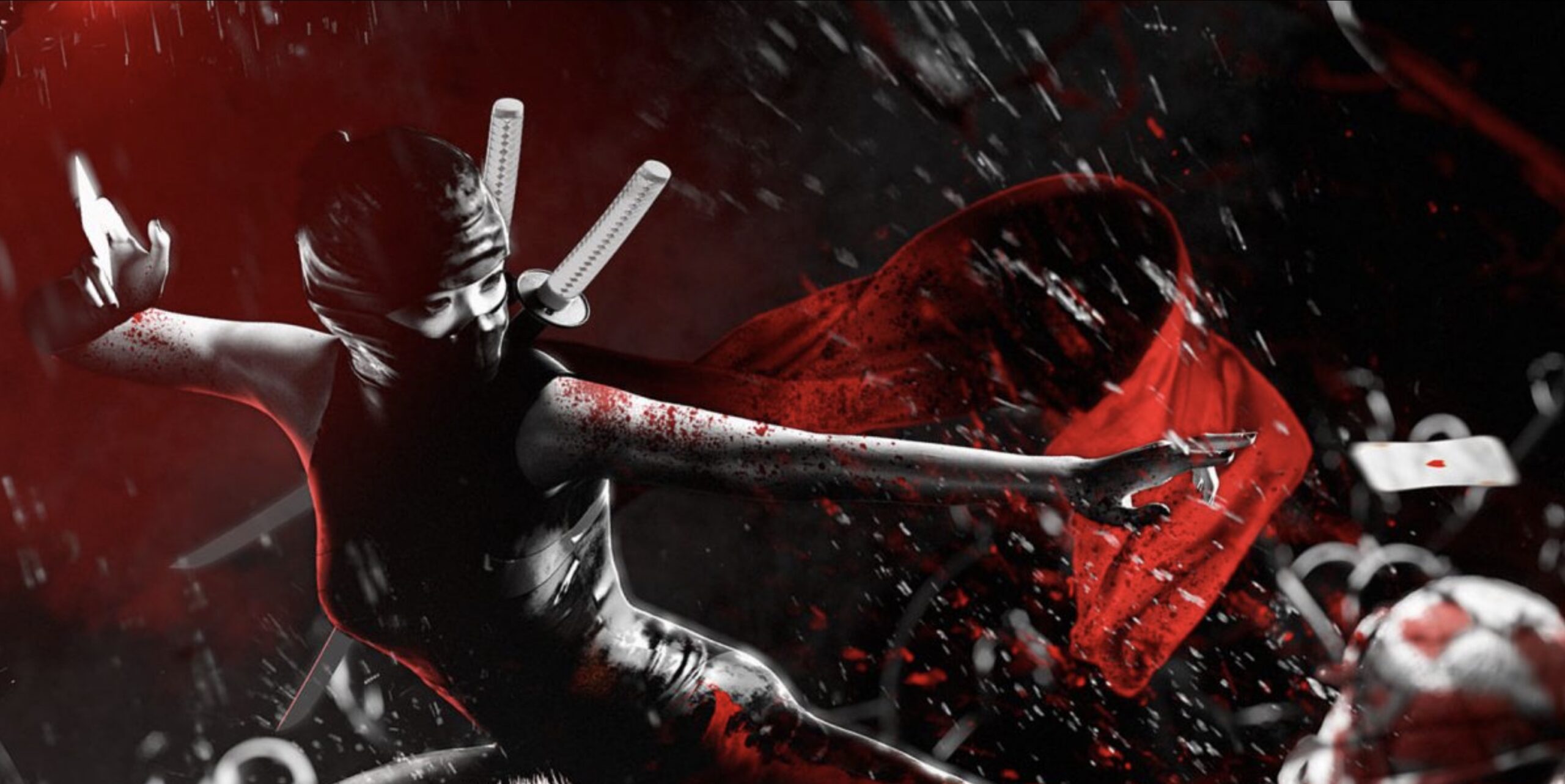
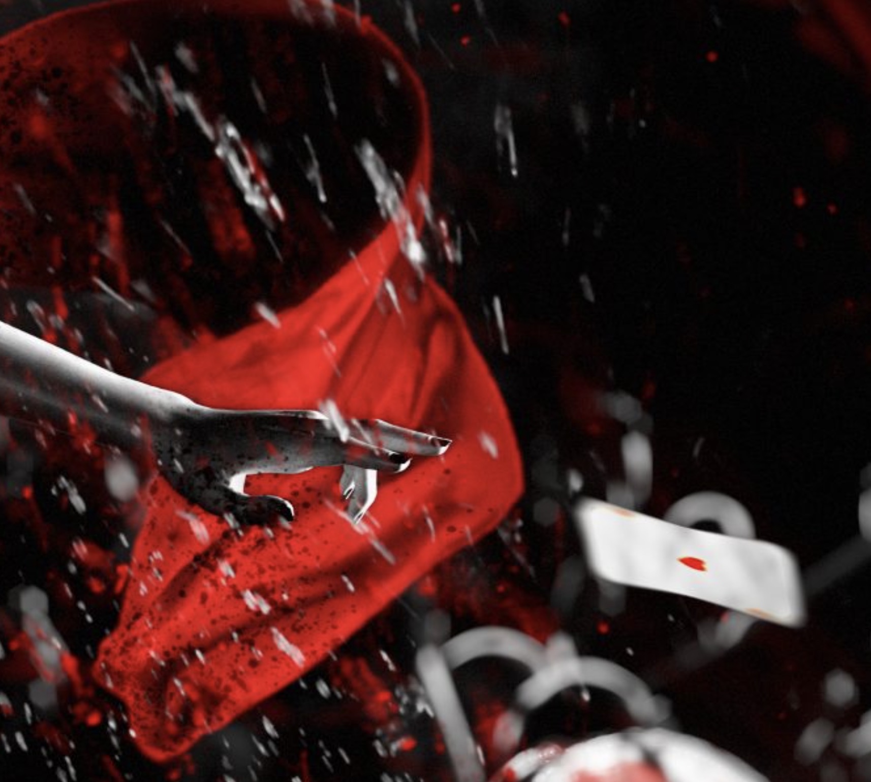
Her techniques and intimidation methods make to anticipate all her moves in advance. Represents agility and speed, she is very concentrated, with premeditated and cold aggression, and her body is ready to jump and send her shuriken (which is a Poker card) to kill everyone.

The Strategy
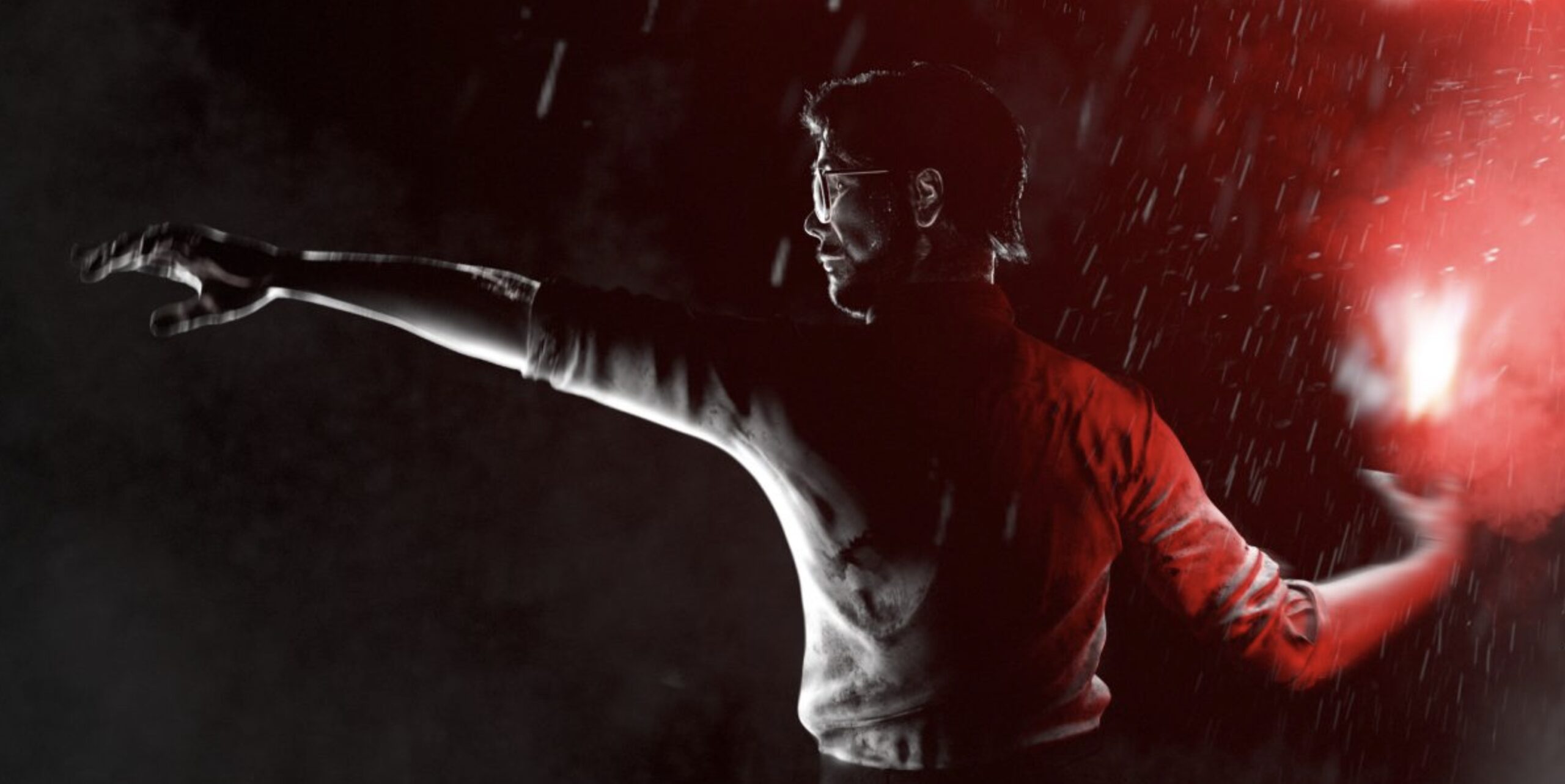
The first of the class, he is more insignificant than the others, but he also defends the team. He used his brain to defend himself, so he created explosives. We can feel the fear but he is focused, he knows what he is doing and calculates the next actions to create a real strategy.

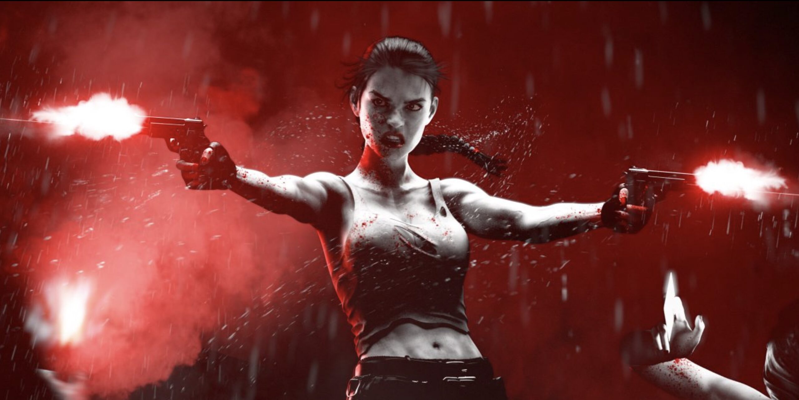
The Seduction
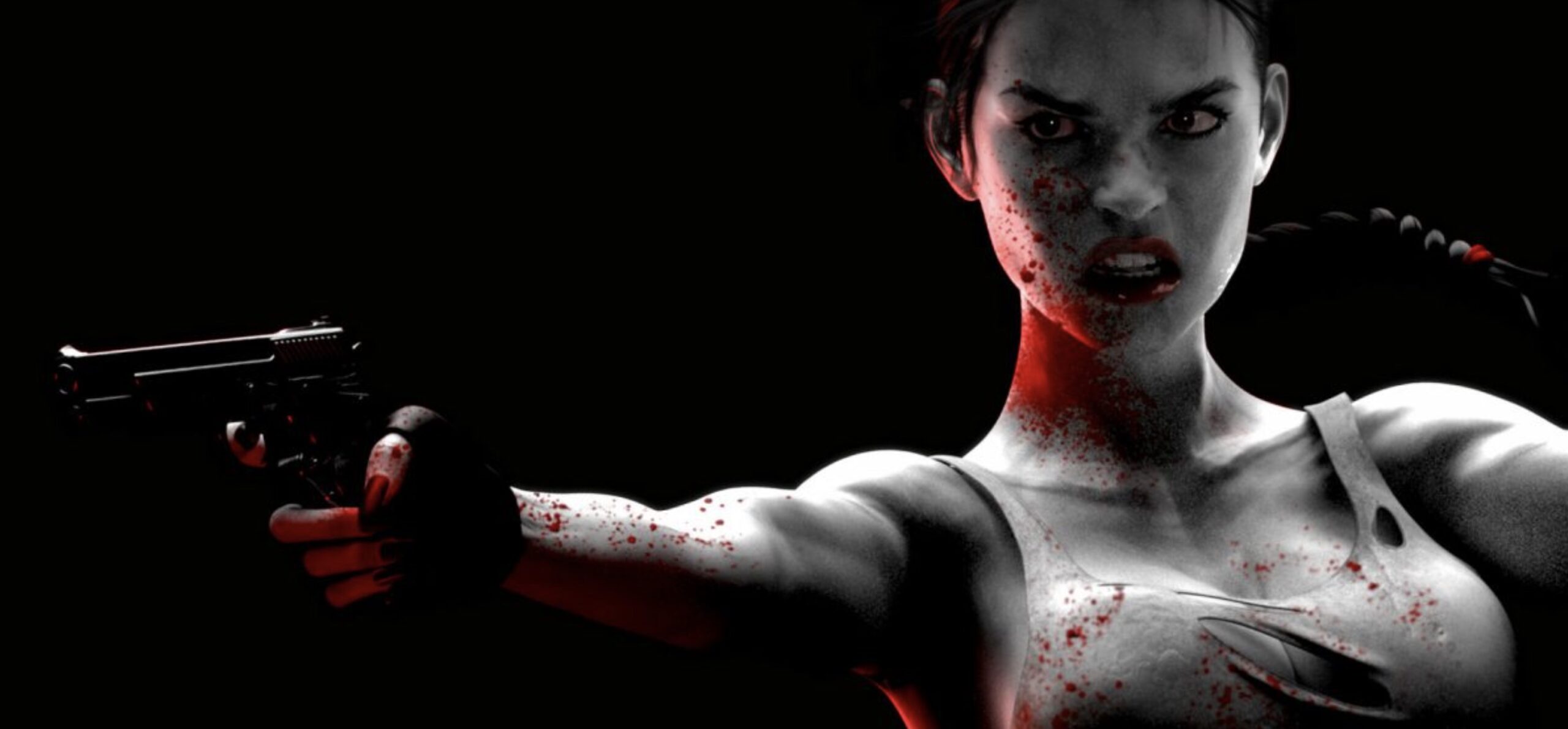
Sexy, luscious, and conquering woman with a strong personality and dual pistols. She has an intrepid spirit and her way of facing all danger is thanks to a bold and decisive attitude. We feel that she is determined, takes pleasure in war, she likes action and she is fully into it, her only goal is to win.

References / The Battle
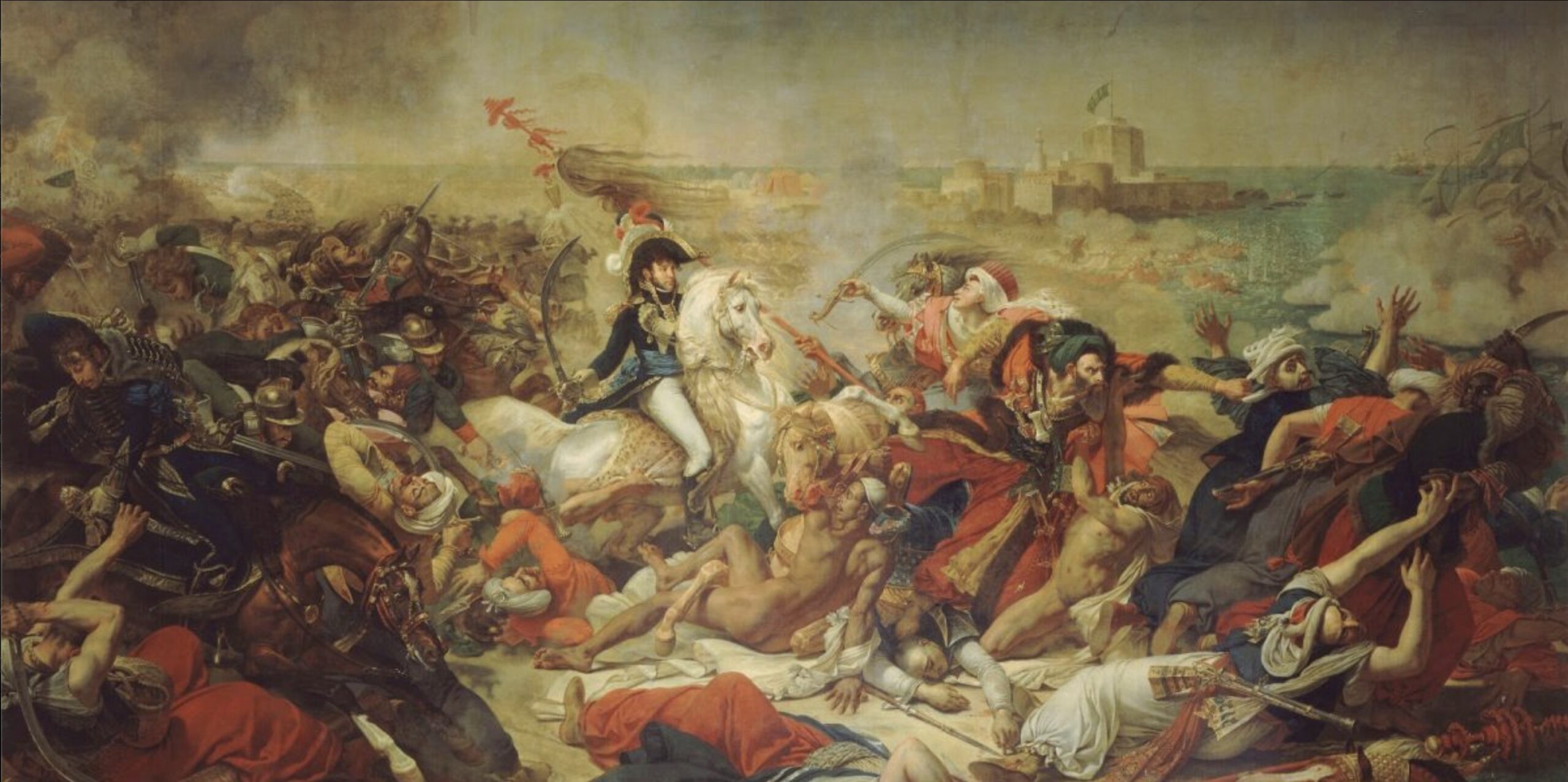
La Bataille d’Aboukir de 1799 Antoine of Jean Gros is a pictorial genre that helped us to achieve our goal. We used codes in this battle painting, whose subject consists of representing scenes, often historical, of battles, particularly significant episodes, by giving a complete view of the field of confrontation without making it possible to distinguish the combatants outside the body movements.
As we can see in this image, the protagonists are immersed in different simultaneous scenes. Our warriors interact with the characters.
References / The Violence
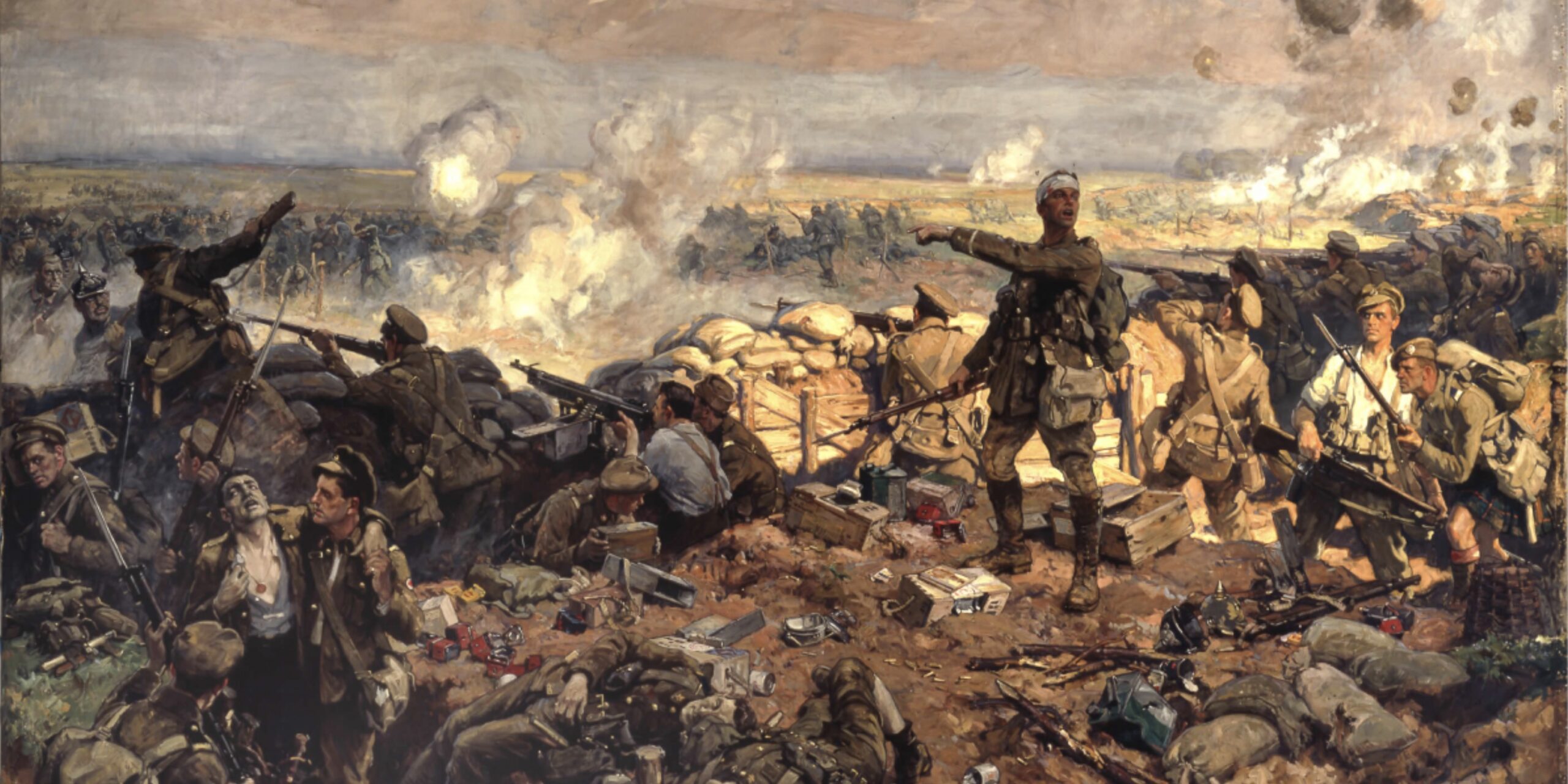
The Second Battle of Ypres of Richard Jack represents physical violence and its visible consequences. The details of the Caravage image and the Bataille de Poitiere of Steuben inspired us to understand that there is no such thing as a battle scene without the wounded or the dead. Blood, which spurts from a gunshot wound, in small drops on a combatant’s face or puddling on the ground is ubiquitous.
Without being gory or unkind, the presence of this violence was essential to the credibility of our image.

References / The light
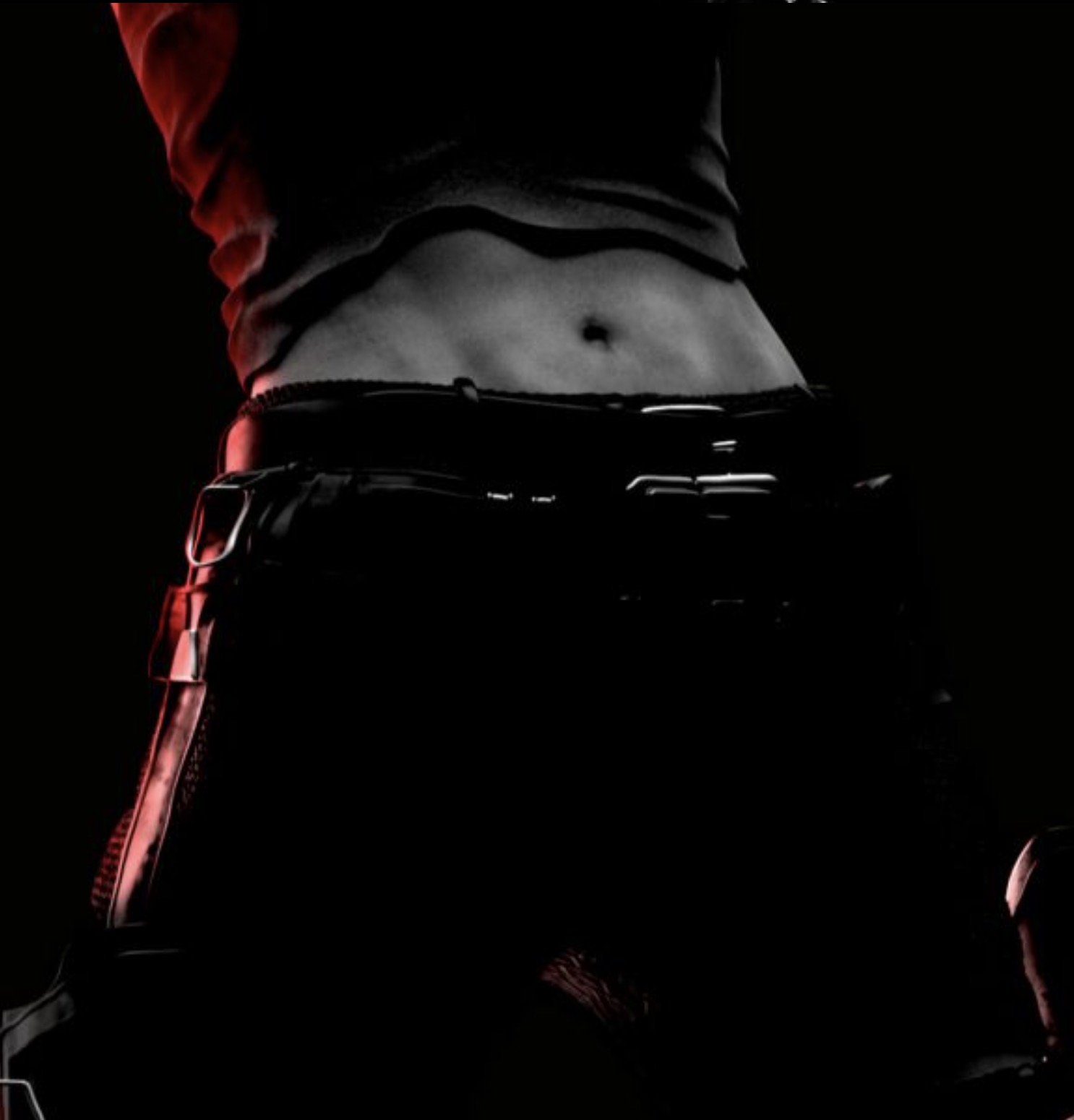
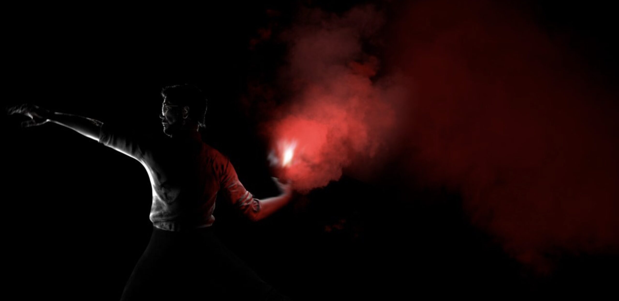
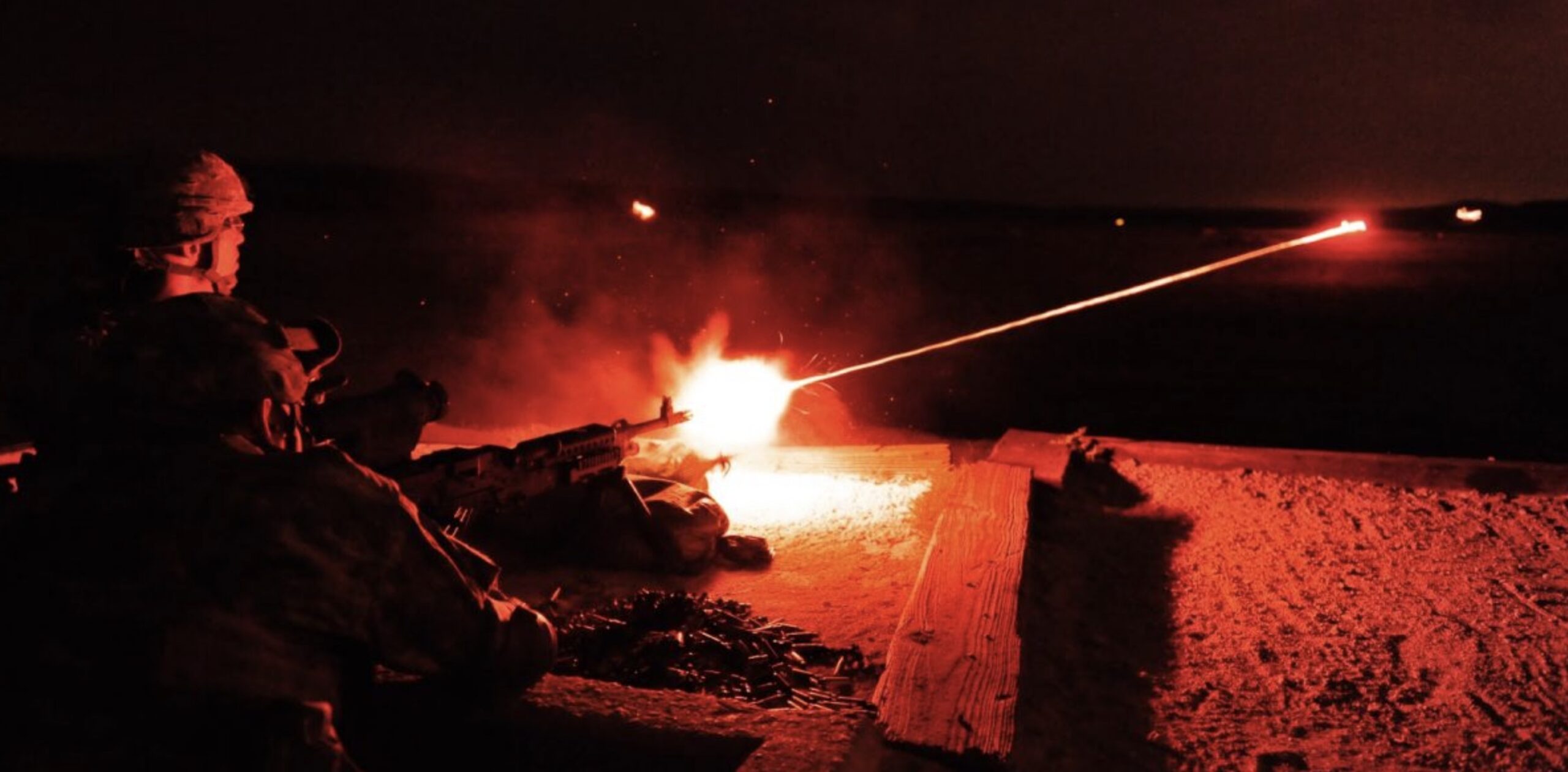
We used two sources to illuminate the scene. The main one is a theatrical, central, and aerial light. The shadows cast by this light give the characters greatness and drama. The second light source comes from weapons and explosions, and gives a red tint, to restrict the color palette to black, white, and red.
We added auxiliary fonts to ensure a reading of the faces and details. Adding depth of field, granularity, and image distortion helped us make the scene more realistic.
References / The Noise
Transcribing noise through the image in such an amazing scene, allowed us to add life. We thought of a possible animation production in the future, that’s why we explored the sound simulating what each character hears, generating a very interesting image.
Federico Gonzalez
Mathieu Felix
Javier Pinto
Andrzej Dybowski
J.A. Duran
Eighty4
Felipe Kenji
Carlos Robles
Felipe Kenji
Carlos Robles
Vanesa Palmeri
